Whether you want to increase ecommerce conversions or drive more white paper downloads, capturing user data through effective squeeze pages can help you generate valuable leads that you can take full advantage of. In this blog, we’ll be exploring a few fundamentals when it comes to creating squeeze pages.
What is a squeeze page?
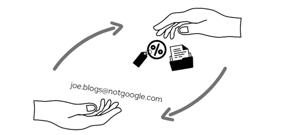
Squeeze pages are designed to capture email addresses from users who visit your site. While technically a type of landing page, squeeze pages serve as a type of carrot on a stick by offering an incentive that benefits both the user and you at the same time.
The idea behind this is called reciprocity, a persuasive technique which can be found in many social situations, both online and offline. It can be summarised as simply, “I scratch your back – you scratch mine”, I give you something for free, you give me something back. This favour-based system is also found in web design in order to increase conversions. A common example is; you can have this whitepaper for free, but you have to give me your data (contact details, email address, etc). Whilst this may come across as giving information away for free, it is never truly free. The value of how a user sees their own data is entirely subjective. On the other hand, to a business the data can be very valuable. For instance, the email addresses collected from this technique can then be added to a marketing list for future remarketing or promotional purposes.
Squeeze pages can be extremely difficult to identify sometimes due to their situational purpose. For instance, you may see squeeze pages used to encourage users to sign up for specific Black Friday deals newsletters, and then that page is shelved till the next year. Squeeze pages have a lot in common with landing pages or other lead generation pages, i.e., “Contact Us.” This is due to the similarity seen in these types of pages, such as simple form fields and limited navigation.
What’s the difference between a squeeze, landing and splash page?
Squeeze page
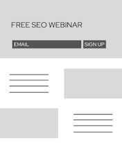
A hyper-focused standalone page with minimal text, limited navigational elements, and clear CTAs in order to capture email addresses. It can be used for both ecommerce and lead generation businesses. It is usually positioned as having an incentive for a user to hand over their email address, such as offering content, discounts, or a contest entry, for instance. “Squeeze page” pop-ups can be one of many squeeze page forms; regardless, the final goal of any type of squeeze page is to capture email addresses.
Landing page
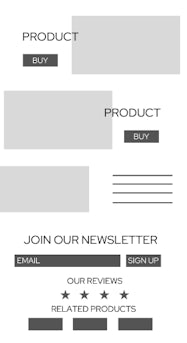
A highly curated standalone page designed to encourage conversion by using a combination of psychological triggers, such as social proof, well-positioned CTAs, and persuasive text. Landing pages are suitable for both ecommerce purchases and lead generation signups. Landing pages can also have one or more actions within the page, such as signing up to a newsletter list or clicking through to another page.
Splash page
A page that appears before any other page on your site. It can be informational or conversion-focused, i.e., “select your country” or “sign up for this webinar”. They can usually be clicked off, and then you are taken to the desired page. They can be confused with popups, landing/squeeze pages, and lightbox popups.

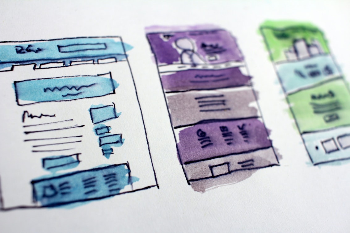
What makes a good squeeze page?
When creating a good squeeze page, you should still keep the same sort of copy and design fundamentals in mind as when creating a landing page, but with more focus on minimalism and the main call-to-action.
Below are several best practices you can use when creating the design and copy of a squeeze page.
Squeeze page design
Use psychological colours (but use these to complement your own brand colours where possible). For example:
- Reds – for urgency & danger, as well as excitement and passion
- Blues – for calmness & trustworthiness
- Yellows – for energetic & exciting, as well as joy and warmth
- Green – for safety and progression
Keep capture forms simple, but effective!
- An email form field will do. Some include name form fields, but any more would require more effort for users to include additional information (job title, company industry, etc.). The more form fields you add, the lower the fill rate will be.
Include simple visual assets (1 or 2 but no more)
- It helps identify what the page is about and what a user might get from signing up or completing a form.
Can include a level of social proof
- For example, short snippet testimonials, or ‘X amount of downloads/sign ups’.
Simple CTA positioning
- Use bright, bold, and large buttons that draw the user’s eye.
Squeeze page copywriting
Use actionable & persuasive language – but keep it short and simple
- ‘Limited time’
- ‘Free Webinar’
- ‘Only £X’
- ‘Sign up now’
- ‘Get the whitepaper’
- ‘Exclusive’
Keep any descriptions or flavour text short
- No more than 1 to 3 short snippets to provide context.
- These are words that create a response in the user viewing the page ranging from tying the product to the user with language such as “you, your, yours, my” to words that give us a nudge down the funnel such as Now, Instant, Free and Get.
Examples of high converting squeeze pages
Cowboy
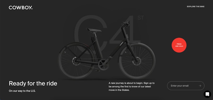
What they did right:
Cowboy has really taken the concept of the squeeze page and taken it to the next level. They have done this with intractable elements on the site that a user can engage with without it taking too much attention away from the purpose of the page. They have minimal navigation aside from ‘Explore the bike’, as well as effective persuasive text; ‘a new journey is about to begin’, ‘be the first’, etc. They make the process of signing up streamlined with this single form field and use micro-text to inform the user what they need to fill out.
What they could improve:
No doubt their design is slick, but to possibly improve it further, they could better utilise psychological colours (such as reds or subtle yellows), especially around the CTA.
Spotify Culture Next
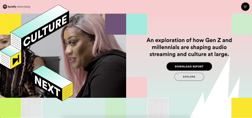
What they did right:
Spotify’s ‘Culture Next’ report provides an excellent squeeze page to generate sign-ups. Instead of using psychological colours for their CTA, they use contrasting colours that work to the same effect as it allows the element to stand out from the page. The bright, pop-pastel colours complement the Spotify brand and suit their target audience: Youthful, progressive, and ideal for young professionals. While there are two modes of navigation (‘Explore’ and the “hamburger” button), both are extremely limited. Spotify makes the most of the minimal approach that comes with squeeze pages and decides to utilise a video as an engaging element within the page. Video is a good medium when it comes to creating squeeze pages because you’re able to convey information and messages without having to include additional text or other multimedia elements.
What they could improve:
The sign-up process on the site could be improved. It may be unnecessary to include a ‘download report’ button which then opens up a seperate form. The form could’ve just been there on the page without the need for an extra step. The number of fields within the form is also quite high. Whilst it is useful to capture meaningful data, this could have just been a name and email form (including opt-in marketing).
However, this may have a limited impact on the number of sign-ups they could generate as the report is coming from Spotify, a leader in the music streaming industry. People may be willing to take extra steps to complete the sign up.
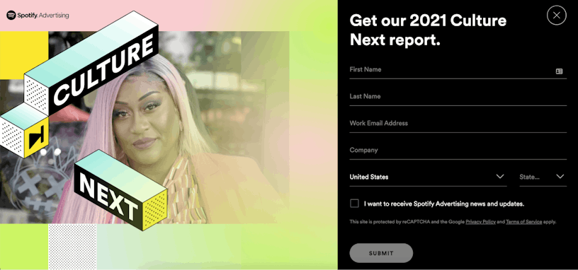
ETQ Amsterdam
What they did right:
The squeeze page pop-up from ETQ could be confused as a splash page, however, one key thing here is the limited navigation. As stated previously, limited navigation is one of the best practices for squeeze pages. On the other hand, splash pages can have multiple navigational elements. Here, this pop-up has a ‘cross’ or a ‘no thanks’ button, which is limited enough.
The pop-up here is clear in what it’s trying to achieve. The simple, persuasive and informative text, i.e., ‘Stay in the know’, ‘Join our newsletter’, ‘Receive 10% off’, provide both context and encouragement for users to take action and convert. Another good element is the simple form—two fields and a subscribe button—which makes it incredibly easy to sign up.
What they could improve:
Two potential areas of improvement could be the use of psychological colours and the field microtext. While the design is clean and straightforward with its intentions, the black and white across the page could be seen as inspiring or not very eye-catching. The thought behind the micro text ‘Like Surprises?’ is understandable as it drives intrigue. But to a user, the functionality of this can come across as quite vague, leading to confusion. Clicking on ‘Like Surprises?’ takes you to a form field with micro text ‘YYYY-MM-DD’. Whilst this implies that a user should input their date of birth, it never explains why; it only implies. This could be off-putting to a user and should be clearly explained.
Prometheus Fuels
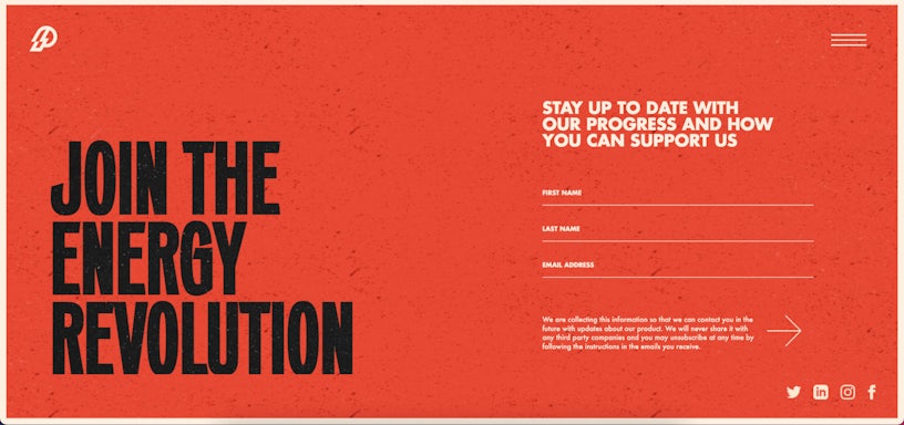
What they did right:
Renewable fuel company, Prometheus, uses psychological and contrasting colours well to demand attention. In combination with persuasive and community-driven text such as “Join the Energy Revolution”, the whole page screams excitement! There is very little distraction on the page, so the contrasting colours of white and black on a red background draw your eye to these two elements. The form fields meet the expected requirements for a squeeze page; they are short and simple.
What they could improve:
While it is already an engaging page, I think the page could benefit from at least one visual asset. Without exploring further into the site, you wouldn’t know that their renewable energy project is specifically for the automotive and aviation industry. With a visual asset, such as an image, this could be clearly communicated. The page does have limited navigation, but I can’t help but notice the social links. Even though this is useful to generate organic social media, it could be some form of distraction away from the form, which is the main goal of the page.
The CTA needs a mention here, a white arrow is a good directional cue but does not stand out from its surroundings and is non-standard so users have to interact with some unfamiliar to them increasing the users cognitive load.
Chargebee
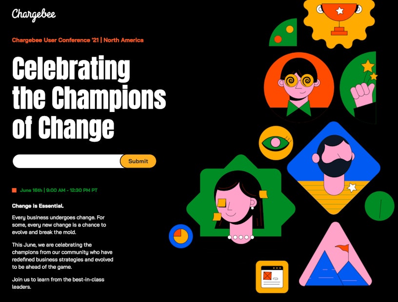
What they did right:
Chargebee’s page is a little longer than your average squeeze page, but this can be a good thing depending on the context. As this is for an event, it would be good for the user to know what sessions are on, who is speaking and what industries they come from. The inclusion of social proof in the form of testimonials from past event attendees is also very useful here as it reinforces the speaker’s value proposition with authority and expertise. This is all found on their page whilst keeping navigation elements limited. This page is also complemented by a good choice of contrasting and psychological colours. The biggest achievement is the single form field. It is incredibly easy to sign up with no additional information needed!
What they could improve:
It is quite a long page, which after some refining could’ve been shorter. The current information is useful and should be included, but some of the flavour text (as seen in the screenshot above) could’ve been made shorter and more concise. The lack of micro text and context for the form can come across as confusing. What am I supposed to enter? I had to inspect the page and find the form element to know that an email was required. Also, what am I submitting? Am I signing up for the event, or am I putting myself forward as a potential speaker?
Changing ‘Submit’ to ‘Sign-up’ for the form button could be more informative and friendlier from a user’s perspective. ‘Submit’ is a very negative term used by developers because that is the action of the form, to submit data to a CRM system. Therefore, the current button may come across as unfriendly and off-putting to the user.
The visual assets here could be a little too much to distract the user from the content and the CTA. Whilst it can come across as ‘young’ and ‘techy’, it can still be seen as being quite vague. The images are also animated, which can also distract the user. Cutting these down to one or two different assets could provide greater context on what the page is about and what target audience it’s for.
If you would like to learn more about CRO, keep up to date with our blog posts. We also have CRO webinars available on our resources page for you to explore. You can contact us here if you want to talk to us about how you can turn more clicks into conversions.


