Well-crafted landing page designs add value to your site’s user experience. But are looks alone enough to convert? We’ve handpicked 7 of the best high converting examples to inspire your next landing page design.
Landing pages on your website can help to persuade visitors to take a desired action, whether it’s signing up for your newsletter, creating an account, downloading an app, or purchasing your product or service.
Pages that are well-designed and optimised for high conversions will always outperform those that are not. However, it is surprising how many websites miss some key fundamentals when it comes to creating a good landing page design. This could be the use of certain specific colours or images that inspire action, or the positioning of call-to-action buttons on your landing page.
Bombinate
Fashion + Homeware: FOMO
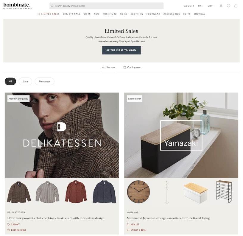
When looking at Bombinate‘s limited sales landing page, you know exactly what you’re going to get. Bombinate takes pride in providing users with artisanal homeware and clothing, this can be told from the use of effective titles and subheadings to the use of minimalist design and microcopy in the search bar.
Whilst the primary goal of the page above the first average fold is for you to sign up for their newsletter, the secondary goal also uses an effective psychological trigger that prompts urgency.

Centering the copy and the CTA draws the eye to the centre of the landing page. The copy and CTA utilises a mix of urgency and anticipation to evoke FOMO, the fear of missing out. This is evident in the ‘Limited Sales’ and ‘New releases every Monday at 3pm UK time’ copy, but the ‘Be The First To Know’ copy adds belonging bias with the sense that you will be receiving a privilege that others will not.
Just below, the tabs ‘Live Now’ and ‘Coming Soon’ add to the sense of anticipation, directing users to see what limited sales may come in the future and prompt them to sign up to the email listing to stay in-the-know.
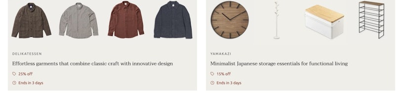
The small selections on display provide appealing examples of the types of clothing and homeware these brands offer without listing them all. Whilst missing out on the option to identify ‘the most popular’ the connotations of ‘most popular’ (mass produced, for example) would contradict the brand’s artisanal value proposition.
On the other hand, the supporting copy educates the user on the style, attributes, and attractiveness of products, thereby adding a greater sense of value, such as:
- ‘Effortless’
- ‘Classic craft’
- ‘Innovative design’
- ‘Minimalist Japanese’
- ‘Essentials’
- ‘Functional living’
The perceived high quality of the products contrasts with the available instant discounts. This includes timed scarcity (again, drawing on FOMO aspects), which is extremely effective at persuading users to click-through and convert. This well-placed juxtaposition of quality and discount tells the user that they will get greater value for money.
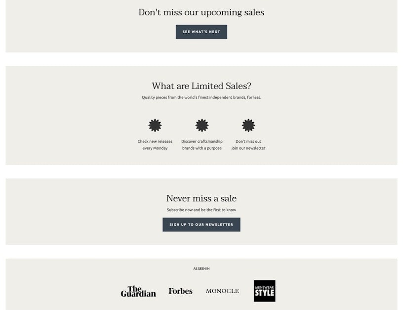
This sense of FOMO and anticipation is reinforced further down the landing page, where you can see the ‘Don’t miss our upcoming sales!’ and ‘Never miss a sale’. This is accompanied by a section designed to inform the user with some frequently asked questions in order to alleviate any fears of missing out on this sale; ‘but don’t worry, the next one will be here soon!’
This is supported further by the social proof section, which not only acts as a way of building trust, but also as a way for a user to recognise other brands that they may already know and engage with. This also informs us of Bombinate’s target audience’s persona through associated brands too!
Huel
Lifestyle: Familiarity and community
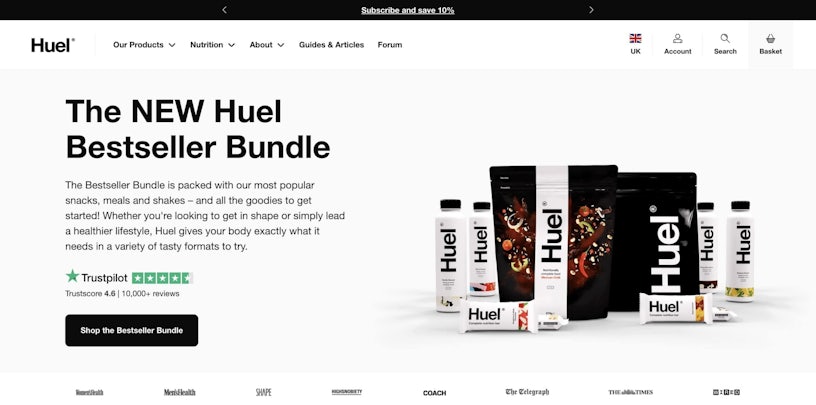
Huel is a big brand name in the food supplement industry, and their click-through landing page design wants you to know it! One of Huel’s brand goals is centred around building a brand community, hence their customers are also known as ‘Huelians’.
This is reflected in their use of social proof, bandwagon, and anchoring tactics, such as the use of their Trustpilot score and featured brands, as well as ‘Bestseller’ and ‘Bundle.’ Fear of being too late to jump on the bandwagon is one psychological trait that could affect conversions, which is why the persuasive copy ‘New’ implies it’s a great way to start.
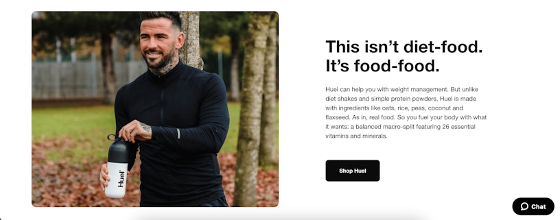
Huel’s other tactic here (as seen in the image above) is to alleviate fear by reinforcing the idea of a status quo. Food supplements are exactly what they claim to be: supplements. A common concern is that a user of their product will not have the same experience when using Huel as they would with actual food.
This idea of maintaining the status quo is further reinforced by the imagery accompanying it, which depicts a healthy, fit, and attractive man using Huel (a personal connection of what you could look like if you used Huel!)
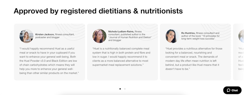
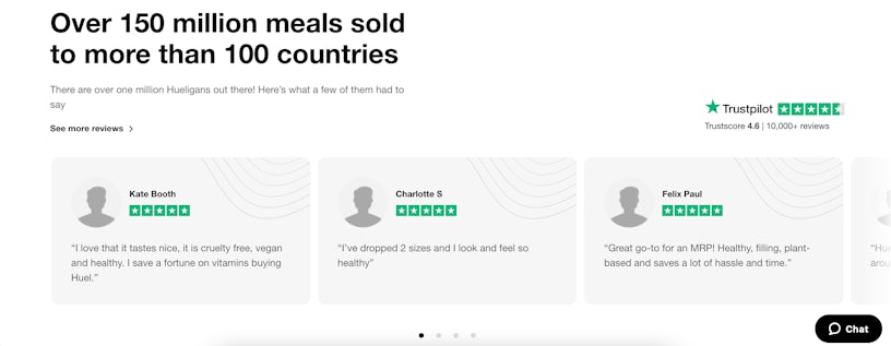
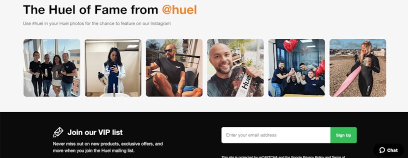
Huel, as demonstrated above, relies heavily on social proof and creating a sense of belonging bias and choice supportive bias to try to alleviate buyer’s remorse.
Let’s also not forget the use of the site’s chat box, which allows users to contact the brand and speak with a representative who can address immediate concerns. This can further foster a connection between the brand and potential customers.
Abbott NYC
Beauty: Limiting analysis paralysis
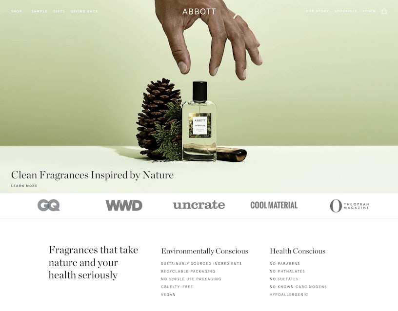
Abbott‘s inspirational landing page design combines stunning photography evocative of nature with the use of clean colours that represent purity, all within a minimalist layout. Abbott’s landing page design incorporates an attention, interest, desire, and action approach.
The hero image featured in the first average fold draws your attention to a single product (Attention), followed by social proof and inspiring copy that captivates your interest by presenting the brand’s values and what you can expect from their products in easy-to-read bullet points. Their copy is aimed at users who share the same ethical values as the brand, namely the environment and their health (Interest).
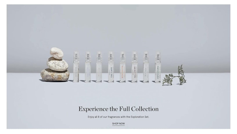
This section allows the user to acquire fragrance testers before purchasing a full bottle. It serves as an entry point into the brand and its products (Desire).
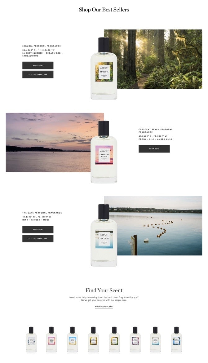
Notice how there are three on display? This is done to avoid choice paralysis. If all eight were presented on the same page with the same level of detail as these three, there would be too many options to choose from, reducing the likelihood of conversion. Labelling these as “best sellers” reduces the risk posed to a new user before they purchase. It is safer to jump on the most popular bandwagon (Action).
Persuasive copy such as ‘your scent’ is quite common in the beauty industry. ‘Get your look’, ‘Find your colour’, for example, adds a sense of personalisation which will engage users.
Dropbox
SaaS: Positioning CTAs
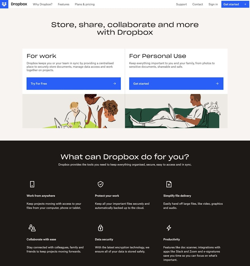
Dropbox‘s landing page design clearly displays what it is, what it does, and who it is for all on the first average fold with eye-catching calls to action. It uses a flat design with large, bold, and bright blue buttons and a limited colour palette for an easy-to-read, uncomplicated experience.
To appeal to each audience, CTAs and supporting copy use a variety of styles. While not as appealing as ‘Free,’ ‘Get Started’ is an actionable use of language that implies that it will only take a short amount of time to set up and begin using.
Dropbox has strategically provided a free version for those looking to use Dropbox for work, a try before you buy approach, as work plans are more expensive than personal plans. Free trials add value to your service, and if a business integrates the service into their day-to-day operations, they are less likely to leave.
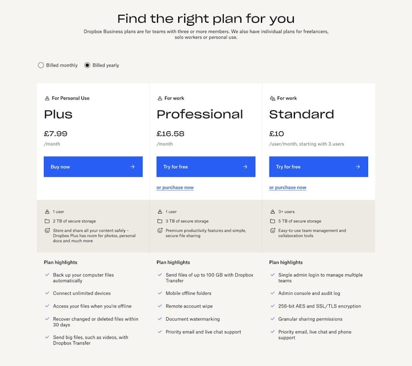
In addition to using personalised copy to ‘find the right plan for you,’ it divides two audiences into three distinct groups. Those for personal use, professionals, and for a team. Each plan clearly separates the perks into categories using different colour shades to distinguish them, along with the use of tick bullet points, which makes it easy to read and to compare and contrast.
The copy also emphasises the benefits of using different plans for each type of user and their needs. For example, for personal use, you may need to use your work offline, whilst a team leader may need admin controls over an entire team.
You may also notice that the CTAs are positioned next to the plan titles. Having the titles and prices positioned next to the CTA buttons prevents users from clicking the wrong plan, which they would be unable to see if the button was hidden beneath the supporting copy below the CTA. It also informs the user that there is further information below without directing them away from the current page.
Wise
FinTech: Instant actionable results
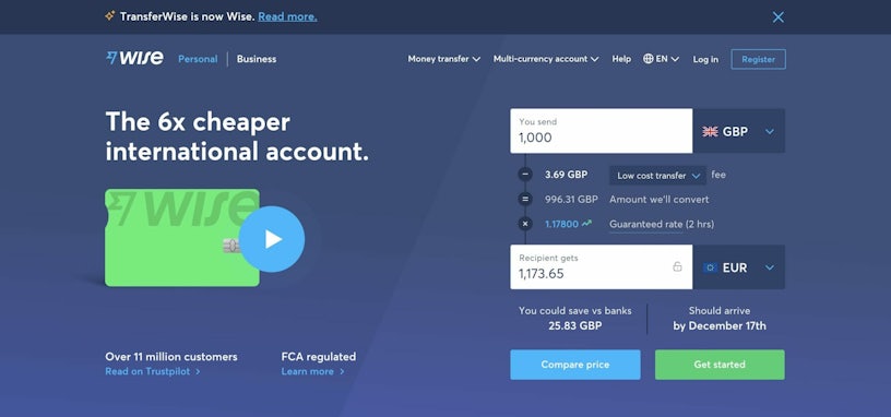
Wise (formerly TransferWise) provides users with instant, actionable, and tangible results. Their landing page provides an interactive experience without requiring the user to leave the first average fold of the page or navigate to another page. This is a good way to keep users engaged and in control, so they feel in control when it comes to converting.
In addition, they addressed customer concerns with social proof and persuasive text, such as ‘Over 11 million customers,’ ‘FCA regulated,’ and ‘Guaranteed rate.’ This is accompanied by the pressure point of including a date, which gives users an idea of when they should expect to receive their product or service. If a user has a tight turnaround time, this may spur them into action.
Wise’s landing page copy plays heavily into the loss aversion aspect of persuasive language, as seen on other FinTech websites: ‘6x cheaper’ ‘You could save vs banks’. We tend to avoid anything that will result in a loss and instead gravitate toward things that will allow us to gain, such as money.
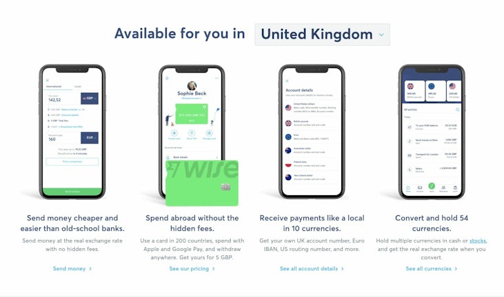
Wise also offers localised options based on your location. This not only provides international users with a sense of familiarity, but it also provides you with local benefits.
Seal + Co
Professional Services: Effective one page designs
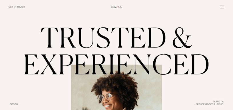
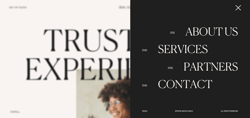
Whilst some people may be sceptical of one-page websites, the majority of these sites have a single simple goal designed for a specific target audience. The goal of Seal + Co, a Canadian accounting firm, is for people to contact them via contact form or phone. One-page websites, like this one, provide an extremely easy navigation experience and are clearly aimed at achieving their form of desired conversion.
Each of the four corners of the page contains important information: scroll (action), contact (action), burger menu (navigation), and ‘based in Spruce Grove & Leduc’ (local location). The effective use of white space and a large serif font header that draws attention to the centre of the page exudes high perceived value that leaves a good first impression, which is ideal for this type of professional service.
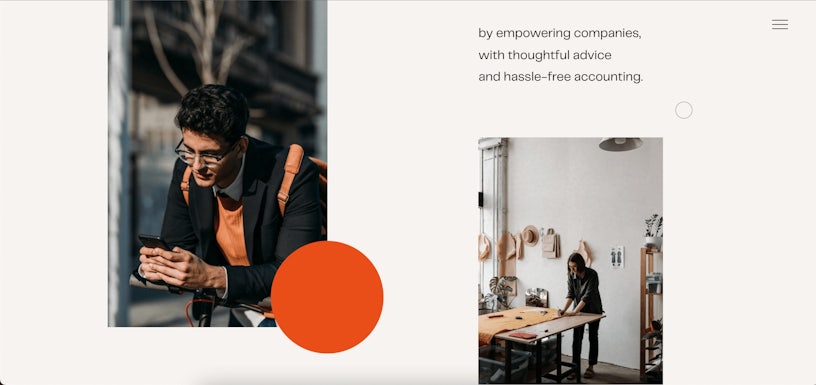
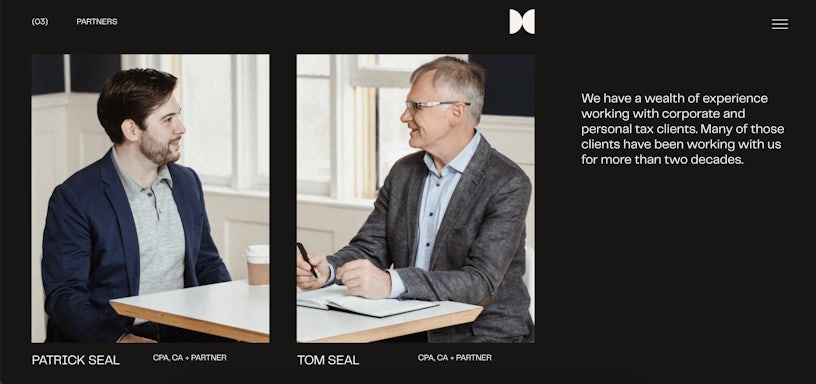
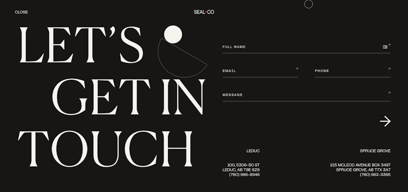
The entire site is supported by people-focused photography, which is appropriate for a service that is centred on people, such as accounting. This is further reinforced by the effective use of pastel and contrasting black and white colours, which give the site a sensitive, youthful, serious, and honest look and feel that leaves a memorable experience.
Skillshare
Educational: User-friendly sign-up
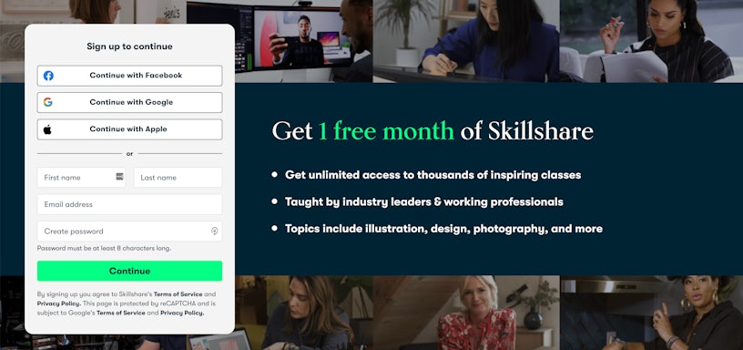
Skillshare’s landing page design is clear, convenient and provides a great ‘try before you buy’ approach to their service, a great way of building trust and allows you to judge if the service would be good value for money.
The effective use of contrast colours draws the eye to the sign-up CTA, and the use of minimal supporting copy creates an easy-to-read, digestible experience. For example, Skillshare breaks down their USPs into three bullet points that illustrate what users can expect from using their service.

The main call to action form on the left is of most interest. Whilst the name, email address, and password requirements (with effective use of microcopy to save space) are quite common on most sign-up forms, the most standout feature in this form is the ability to sign up with Facebook, Google, or Apple.
This is a convenient, user-friendly approach that is ideal for creating a high converting landing page design! By using memorable information, such as passwords, from the user’s account, it reduces time to complete the registration process.
This type of social sign-up process is emphasised as Skillshare’s primary goal, as signing up with these accounts can also provide Skillshare with the additional benefit of using these connected accounts for additional marketing purposes, such as having access to better data.
In addition, Skillshare has strategically limited these options to three types of accounts: Facebook, Google, and Apple. Because Facebook is the most popular social media platform in the world, users are more than likely to have a Facebook account to sign up with. Because of Google’s popular integrated services, such as Gmail, Drive, and the Google Play Store, this is a similar case. Apple, on the other hand, may have been purposefully chosen to make it more convenient for iPhone users, as users can also register using the Skillshare app on iOS.
We hope our handpicked high converting landing page examples will inspire your next landing page design for your next marketing campaign! If you want to learn more about CRO fundamentals and how they can help you create better landing page designs, we have some tips and advice for improving your conversion rates.
Did you know that we offer a range of CRO services such as A/B testing and User Testing? You can contact us here if you want to learn more about how we can help you.


