New year, new SERPs. Google has changed the look of the desktop search engine results to include favicons and newly designed ad listings. The URL of each result now sits above the page title, with the link changed to black text.
These changes have caused controversy amongst webmasters, with many upset because they feel as though ads are now indistinguishable from organic results. Some have also complained that usability has been affected, as they are finding it hard to read the results. I took a closer look at whether or not the new design is an improvement.
Google reveals changes are coming to desktop
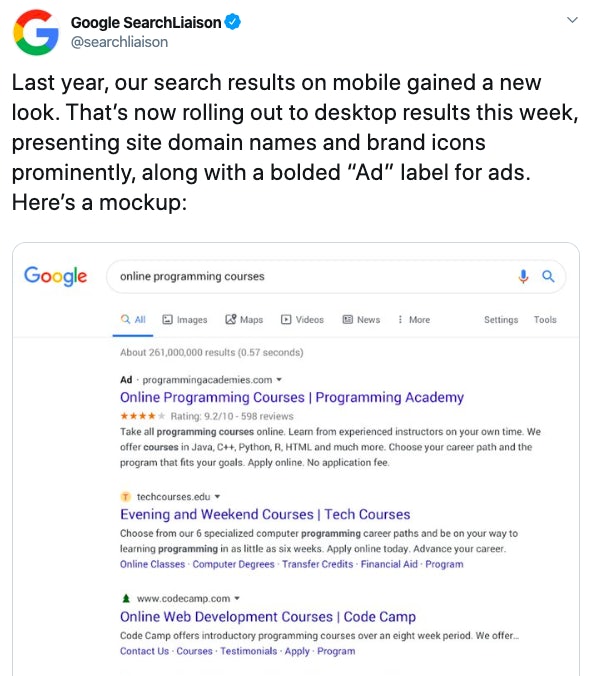
Danny Sullivan, Google’s Search Liaison, tweeted about the changes on January 13th, stating that they were rolling out on desktop after a successful transition on mobile.
However, the replies to his tweet are full of unhappy search users, claiming that they hate the changes and want the SERPs reverted back to the old look.
Users declare the new layout is “unusable”
One user in particular, Jeff Seibert, has claimed that the results have rendered Google “unusable”.
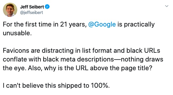
He explains that he doesn’t like the new layout as “nothing draws the eye”. As everything is black and white, it can be quite difficult to differentiate between each element.
Jeff is not alone in his opinion. Many are calling the new layout “cluttered”. According to Google, the change was meant to help put branding “front and center,” and also “[help] you better understand where the information is coming from and what pages have what you’re looking for.” Unfortunately, users aren’t finding it easier to navigate the SERPs.
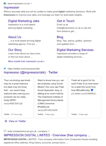
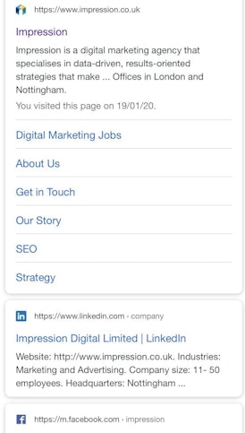
Here are the mobile SERPs compared to the desktop SERPs. On mobile, each different site is contained within its own box, making it easy for users to distinguish between each website. However, the desktop view looks quite cluttered and there is nothing to separate each result. It seems like the success on mobile has not translated onto desktop.
A sneaky move from Google?
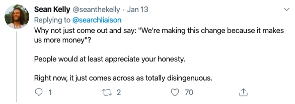
Some users are convinced that Google has made these changes to increase the number of clicks on paid advertisements. One user even asked Google to be transparent about the reason behind the change.
The new ad favicon is smaller and is now in black text, making it tricky to spot within the SERPs. The below screenshot shows a paid advertisement for Deliveroo – if you weren’t looking closely, you could easily click on the paid result rather than an organic one. If this was intentional, Google has cleverly implemented a way to increase their ad revenue.

How will this impact small businesses?
Small business owners are also worried that search users will choose well-known brands over their brand, as they will recognise the more trusted logo and click on the link. It is possible that brands who have established recognition will receive more organic clicks than smaller, independent brands.
This could also have an impact on small businesses who are investing in PPC, as larger brands tend to have bigger budgets. If they are in the top spot, users may recognise their logo straight away and ignore any ads below. To combat this, ensure that your ad copy is clear and defined – James has written an excellent blog post on how to do this.
Of course, some people will immediately resort to changing their favicon to a famous brand icon, to try and trick users onto their website. However, to combat brands using the incorrect favicon, or even an offensive image, Google has warned users that they are able to replace favicons with a default image if they deem it to be unsuitable (see their Favicon Guidelines).
Despite the warning, some SEOs have even tried changing their favicons, and Bill Hartzer went one step further by changing it to the ad favicon. Why, I’m not entirely sure.
Does the new update improve accessibility?
Although there has been a loud backlash towards the update, some users are defending and even celebrating the changes. Gideon (@gidseo) tweeted that the new design is “so much better for visual thinkers and people with dyslexia”.

It is important not to confuse accessibility with usability here. Usability considers user experience design (UX) and these aspects may affect everyone. This is the issue that a lot of people are having with the new layout.
Accessibility considers the online experience for users with a disability, and means that they should be able to “equally perceive, understand, navigate and interact with websites and tools” – w3.org. You can read the Web Content Accessibility Guidelines here.
Although aspects of the new design may not consider UX for everyone, it seems that Google may have improved the web experience for some people with Dyslexia. It is now easier to identify a brand by its logo within the SERPs, rather than reading a wall of text.
In the 2018 research paper “Understanding the needs of searchers with Dyslexia”, researchers found that the participants preferred pages which contained multimedia as it helped “to support their understanding in the event of reading difficulties”. Therefore, brands adding favicons of their logos could potentially help people with Dyslexia to better understand the search engine results.
Whilst accessibility may have improved, this does not mean that the overall user experience has changed for the better.
How we read on the web
Research by the Nielsen Norman Group has identified the “F Shaped Pattern” as a common reading pattern for content on the web.
If a user reads this way, they will start by reading horizontally. This would be the first line of the search result. Now that the SERP landscape has changed, the first line is now the URL. Secondly, the user will scan down to the next line, which would now be the page title.
Perhaps users aren’t finding the new landscape easy to read, as it isn’t natural to read the smaller text (the URL) before the larger text (the title). We often associate the larger font size with the most important information, so it could be confusing our eyes to see the URL above the heading.
Or, it could be a case of the results being so similar that it’s hard for the eye to scan the text.
DuckDuckGo uses favicons within its search engine results, but it looks tidier due to the URL being highlighted in green, like the old Google format. You can easily distinguish between each element, making it easier for the eye to follow. Maybe it’s time to go over to the duck-side (I’m sorry).
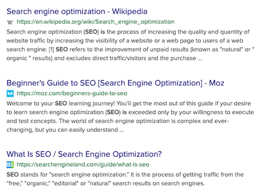
In my opinion, Google needs to bring back some colour into the SERPs to help people differentiate between each result. A black wall of text is not appealing to the eye, regardless of the added favicons.
Recommendations
Whether we like it or not, the SERP landscape is constantly changing. Here are some tips to ensure that your website stands out within the search engine results:
- Add a favicon to all pages across your website using the recommended size.
- Optimise for featured snippets. Our content specialist Ben wrote a great blog post on writing quality content for long-tail keywords.
- Write clear titles and descriptions to inform the user of what they can expect from your page.
And, if you really can’t stand the changes, LifeHacker have written a guide on how to revert back to the old view.
