
Mobile has been important for years, says Jon. But are we truly ready for mobile?
Mobile technology, says Jon, has changed a lot, and websites need to keep up. Basically, if your website isn’t mobile friendly, you are, in Jon’s words, f**ked.
Responsive is the way Google encourages us to go in most cases. But how does Google crawl different configurations? For responsive, in theory it will be both the desktop and user agent will visit the same site and assess from both perspectives.
According to John Mueller at Google, responsive design is the optimal situation because regardless of which device they use to crawl the site, they will get the same thing. They’ll get the same content and the same structured data, videos, images, internal links, etc. Google can find all of that within the HTML even if the content adapts to different screen sizes. But when challenges on this, Google didn’t know exactly the answers; we could just put responsive in place, but it doesn’t necessarily make sense for every single website.
What does a mobile first future look like?
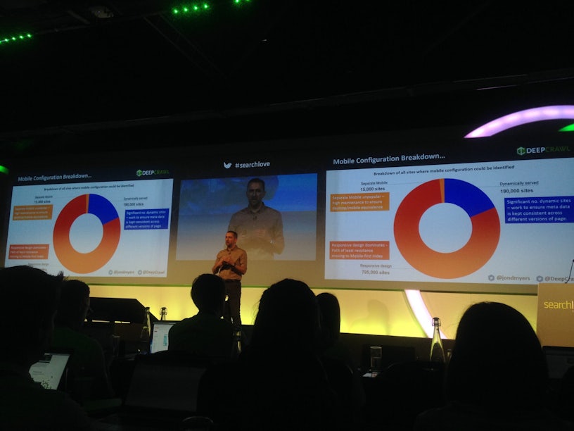
According to Deep Crawl’s data:
- Most big sites are using responsive
- 61% are using the correct canonical
To be mobile prepared, we need to consider:
- Responsive design where appropriate
- Correct canonicalisation
- Page speed
- Use HTTPS
Progressive Web Apps will also, says Jon, be the future post mobile index. Be sure to read all about it.


