
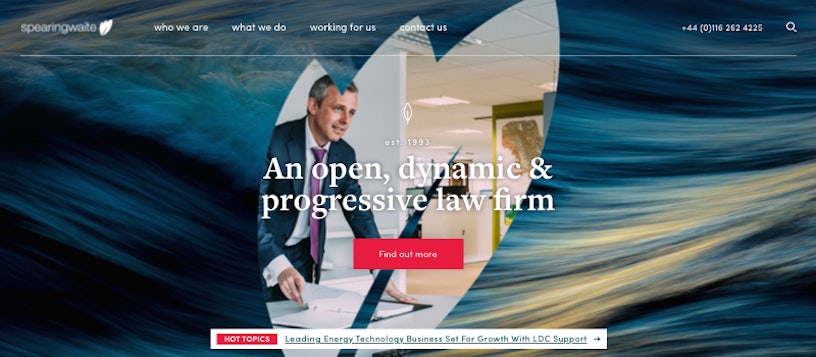
When the law firm Spearing Waite asked Impression to help overhaul its online presence by rebuilding its existing website from the ground up, we knew that we needed some sort of ‘wow factor’ to differentiate the firm from its many competitors. One of the ideas was to use the firm’s leaf-shaped logo to progressively reveal images in a slideshow designed to dominate the above-the-fold area of the home page. The initial design concept looked like this:

The firm liked the concept and was keen to keep it in the final design, which meant only one thing for the development team: we’d have to work out how to build it. We first thought that a background video might be the way to go. Although that would fit with current trends, there were 2 major drawbacks: videos use lots of bandwidth, which would slow the website’s load time and hinder performance, and the firm wouldn’t be able to easily update the images in the video within their content management system: Impression’s highly optimised enterprise WordPress offering. We’d need to look elsewhere. The solution came in the form of CSS masks. Scroll down to see how we built it. This was the end result:
CSS mask basics
Using a mask in CSS means placing an image with transparent parts, such as a PNG or SVG, over an element. Any non-transparent part of the image will act as a mask, whilst transparency will allow anything under the element to show through. The effect is achieved using the mask CSS property. As CSS masks are only supported in modern browsers, which support SVG graphics, we used SVG masks, as they had 90% smaller file sizes than their PNG counterparts. The code below shows the use of a mask in the shape of the Impression logo placed on a blue div. The yellow background behind the div can be partially seen through the div. The only drawback with using CSS masks at the moment is the lack of browser support in Internet Explorer (which is coming soon). However, we thought that the lack of browser support was outweighed by the performance benefits, especially as the feature could degrade gracefully and would not affect the accessibility of the site.
See the Pen Basic CSS Mask by Jamie (@jamieimpression) on CodePen.
Animating the mask
We knew CSS masks were the right way to build the slideshow once we realised they could be animated, just like other CSS properties. Taking the basic mask example above, we can define a CSS keyframes animation altering the mask’s properties, such as the mask-size or mask-position, then assign that animation to the blue div. This results in the following; something much closer to the full effect.
See the Pen Animated CSS Mask by Jamie (@jamieimpression) on CodePen.
Creating the slideshow
To build the slideshow, we needed to use a combination of mask animation and javascript.
Firstly, we created 3 slide elements and positioned them absolutely inside of a container. We then wrote a javascript function to rotate the slides using the z-index CSS property. The active slide would be given the highest z-index, with the CSS class current, followed by the next slide, with the CSS class next. All other slides would have a lower z-index. This basic slideshow would work in any modern browser.
Next, we altered the javascript function to apply an animated mask to the active slide (using the CSS class hide) for 1 second period before the next slide became visible. By creating a mask animation that started by revealing none of the slide below when it first appeared but animated to reveal the whole of the slide below exactly 1 second later, we had created a slide transition using a CSS mask.
Finally, we realised that to create a full-screen-width background slideshow transition by animating the mask-size, we’d have to either (a) start with a tiny mask which would show the next image beyond the edges of the mask before it grew to hide it, and show it again, or (b) start with a mask which covered the whole slide, but then grew to such a large size that we’d see performance issues. To get around this issue, we created an SVG image comprised of each of the frames of the animation side-by-side, and translated the mask in steps 23 times in 1 second, creating a 24fps reveal effect. The first ‘frame’ was completely opaque, whilst the last frame was completely transparent. We used a frame width of 3000px to ensure that only 1 ‘frame’ was visible on a user’s monitor. Our mask image looked something like the image below. In SVG terms, it was necessary to draw an opaque shape (a black area) leaving the areas to be revealed transparent.

A scaled-down version of the final product can be seen in the code below.
See the Pen Slideshow with animated CSS mask transition by Jamie (@jamieimpression) on CodePen.
Thoughts and caveats
Having created a working concept, we needed to transition it into production. We would need to ensure that the slide images were compressed and of the correct dimensions, and that the mask image was preloaded. We’d also have to test to make sure that browsers not supporting the mask still provided an acceptable slideshow experience.
We’re happy with the result, as is the firm, but please let us know if you can think of a better way to implement this feature. If you like implementing this sort of thing for a living, we’re hiring!


