
Your add to cart button is a small detail that can have a large impact on your conversion rate. Whilst perfecting your button isn’t the be-all and end-all of CRO, there are certainly some best practice elements that should be followed when designing your button to make sure it doesn’t get lost in the page and is optimised as best as possible.
Choosing the best colour for your add to cart button
When asking the question of which is the best colour choice for your add to cart button, you’ll get different answers depending on who you ask. You’ll find some people in the green camp and some people in the red camp. The truth is that there is no right answer and you should test which colour works best for your audience, starting with your website’s colour pallet or brand guidelines.
The best way to choose which colour fits your website is by choosing one that visually contrasts with your colour scheme but stays in keeping with your brand guidelines. For example, if your site has a lot of white, try a red button. If it’s black, try a green button. And if it’s blue, try an orange button.
A quick way to figure out which colours contrast is by taking a look at a colour wheel. Find the colour that is most prominent on your site/in your brand, and look for the colour directly opposite on the wheel – this will give an idea of what colour your add to cart button should be. Take this colour, and then look to tweak it to make sure it fits in with your brand guidelines and doesn’t look too visually out of place against the rest of your site.
Canva has a great tool, found here, which will help you to figure out which colour to choose.
Getting the size right and letting your button breathe
Making sure your button is easily found by your customers comes down to the size of the button and where it sits visually in your hierarchy. When it comes to sizing your button, it’s important to make sure it’s big enough for the customer to find but fits in with the sizing of the other elements on your page. If you’re unsure on the perfect size, larger is generally going to be better than smaller – a CTA that is too small can be overlooked or lost in the body content, which could cost you a conversion.
Once you’ve figured your size out, you want to make sure your button isn’t sandwiched between visual clutter. Make sure your button has plenty of whitespace to breathe, and that it isn’t getting lost in the page because of heavy text/design elements surrounding it.
Other things to consider
Now you’ve chosen your colour and got your sizing sorted, it’s time to look at what other finishing touches you can add to your add to cart button to make sure it stands out. A few extras that you might want to consider are:
- Adding rounded corners to your button: you may want to opt for rounded corners on your button to make it more visually appealing for your customers; our brains are conditioned to avoid sharp objects (even in the digital world), this is a concept known as the contour bias, which is why you’ll find the likes of Amazon and Apple have rounded corners on their CTAs. Rounded corners are also known to draw the user’s eye into the centre of the button because the corners point inwards, not outwards.
- Other style elements to make your button pop: you may wish to opt for a border on your button and a slight shadow to give it a more three-dimensional look, adding that extra pop to catch the user’s attention
Best in class examples:
Amazon.co.uk
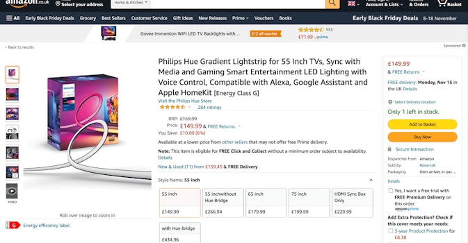
You’ll notice in this example from Amazon, they have two different CTAs, one for add to basket and one to buy now. Both CTAs have rounded edges, and the yellow and orange colour of the buttons are a stark contrast from those of the website colours – white and dark grey.
Tui.co.uk
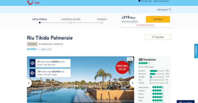
This example from TUI, is a great example of a CTA which stands out because of the contrast of colours. TUI’s brand and website colours are predominantly light blue, if you take a look at the colour wheel, orange is directly opposite. Which is the colour they’ve gone for on their CTA. Even though the button isn’t the biggest element on the page (it’s actually quite small), the colour contrast makes it an element that stands out.
Test, test, test
As with all things on your website, it’s important to test any changes you’re making to key elements like your add to basket button. Implementing testing software such as VWO (our testing partner) will enable you to run such tests. You can then monitor changes made to your site to make sure they aren’t having a detrimental impact on conversion rates, bounce rates etc before being pushed live to all customers.
If you want to learn more tips and strategies on all things CRO, be sure to check out our blog or resources.


