
AMP, Google’s Accelerated Mobile Pages is a great way for publishers to enhance their user experience without damaging any potential SEO benefits. It promotes fast, mobile-ready web pages which work well on mobile devices.
I wrote recently about our u-turn on support for AMP as an SEO agency; we feel that although the software is great for publishers with extremely large sites, for smaller businesses concerned with SEO there aren’t yet enough compelling reasons to adopt.
However, that’s not to say B2B sites can’t attract and gain mobile users. Quite the opposite is actually true. Let’s start off by looking at the benefits of Accelerated Mobile Pages;
- Mobile-first approach
- Faster loading page for mobile users
- Improved search engine presence
- Wide support for ad networks and analytics packages
- Pages are part pre-rendered from the seach results
Achieving mobile success without AMP
AMP does this by the following techniques, as its project website states. Even if you choose not to implement AMP on your website, you should really be considering actioning as many of these points as possible, as research shows that a slow website has a much lower conversion rate. Google also loves fast pages too, and page load time has long been understood to be an SEO ranking factor.
1) Allow only asynchronous scripts
Now whilst in principle, this is a great idea — to block any scripts which must load before the page is registered as complete — unfortunately many scripts aren’t loaded in this way. Many scripts that aren’t already asynchronous probably can’t be in their current form. Consider refactoring some code and further investigate the new HTML5 async attribute. The idea here is that the actual load time of the page is reduced fairly significantly and then the scripts execute following that time.
2) Size all resources statically
Each visual element in HTML — especially images, videos and iframes — can have a specified height and width, allowing the browser’s rendering engine to accurately calculate the required space before the actual element itself is fully downloaded. Many content management systems automatically include this information however there’s a tendency for developers to omit these attributes as browsers can quite accurately calculate this requirement — at a cost of time. To be fully optimised, ensure that dynamic resizing isn’t something you’re making your visitors’ browsers do.
3) Don’t let extension mechanisms block rendering
Whilst this is a feature of AMP, the thought behind it completely makes sense. When using external embeds, features or items, do not allow these to hold up the loading of a page. AMP technology addresses this by loading in most external elements through the amp-iframe element, which effectively sandboxes its content and allows the content to load in at its own pace. In AMP these additional elements are also tagged with the async attribute to ensure where possible that their contents cannot prevent the page from rendering.
4) Keep all third-party JavaScript out of the critical path
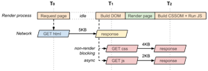
The critical rendering path is the theory behind rendering the page as it’s available, rather than once the browser download is complete. Google explain this pretty well here. JavaScript, especially from third parties, generally runs synchronously, and has a nasty habit of writing in lots of additional requests to external sources.
Ad networks are terrible for this; additional requests can take potentially up to a second each, and there may be 2-3 of these per page. In this scenario, the page render would only be complete after all of those round trip requests. AMP handles this by, again, sandboxing this content into amp-iframe elements so that this isn’t a render blocking issue.
You can mitigate this on your own website by optimising scripts where possible, loading them asynchronously, and also ensuring that your JavaScript runs in the footer of your page. With the rise in the use of tag managers and tag containers, you should also explore the possibility of running your external scripts through a solution such as Google Tag Manager.
5) All CSS must be inline and size-bound
Something special to AMP is that it allows only on-page CSS style scripts. Usually these are required through additional external files. There are pros and cons to this approach;
Pros; this ensures developers practice good code hygiene. The 50KB file size limit is plenty for even the most complex pages, and it saves at least one additional HTTP request to load the page.
Cons; as the style is all inline, repeated elements must be defined at least one per page whereas an external CSS file would allow for this to be loaded only once.
This is a specific of AMP that for a mobile site you would not want to follow, however the best practise outcome is that all code is minified and compressed into only one file required by all pages. This can then be cached locally by your website owner’s and on their subsequent page views and visits, the additional HTTP request will be saved anyway.
6) Font triggering must be efficient

Specific to AMP again, but a play on web font optimisation. Font files used on the web are huge, so they can have their own impact on web page load times. Some fonts which aren’t optimised can block the rendering of text until all of the relevant files are downloaded — sometimes when using a variety of font faces with different weights, this can be dozens of total files from an external font service.
This additional load time and the render-blocking impact of fonts makes it extremely important to be selective of the files which are required, and how they’re loaded in. Many font services now allow for async loading, such as TypeKit.
Other CSS-based font services such as Google Fonts allow you to select the font weights and the package of glyphs required so that you’re not downloading too many items you do not require. Google Fonts, for example, also allows you to reference multiple fonts via one CSS file, which minimises external HTTP requests.
So what can you do? If you’re using external font services, read their documentation to understand how to optimise your usage. Check the glyph sets you’re using (i.e. do you really need the Latin and Greek characters) and request only those that your website needs. If you’re using a service like TypeKit, ensure that your JavaScript is asynchronous.
7) Minimize style recalculations
Changing elements on a page requires them to be re-drawn. Similarly, heavy processing requirements surrounding CSS animations or JavaScript effects, especially whilst the user is scrolling requires the device to constantly redraw the contents of the frame. Whilst most devices will be able to handle these complex calculations, to maintain the 60 frames per second refresh rate many mobile browsers use, much of the calculations need to be completed within 10 milliseconds to not cause a juddering effect to the user.
To ensure you don’t fall foul to this, ensure you’re using the most efficient supported method of creating your animations, limit all unnecessary JavaScript executions, and use your browser toolbars to debug performance. This is a little out of scope of this guide due to the advanced programming nature of it, but if you’re interested please see Google’s advice here and the associated Udacity course.
8) Only run GPU-accelerated animations
AMP only allows animating and transitioning on transform and opacity properties, meaning that the devices browser isn’t redrawing elements. The transform and opacity attributes are handled by a device’s GPU and keeps these jobs separate, as not to slow down the browser’s display of elements.
AMP doesn’t allow every type of animation to ensure that the browser experience is smooth, however on your own website you’re free to use any of the effects you please. Further to the previous point, six, it’s worth bearing in mind how a website is rendered on the page to ensure that you’re using the best animation method possible, therefore keeping your user’s experience a pleasant one.
9) Prioritize resource loading
AMP handles its resource loading in a particular way which can easily be replicated across a number of other platforms. Specifically, AMP loads resources only as or just before they are required. It does this by pre-fetching lazy loading resources (i.e. images below the fold) and it also ensures important content is prioritised.
Additionally, AMP pages can be pre-loaded into the user’s browser just before it’s required from the search engine results page — something which without AMP we cannot achieve.
However, to work towards front-end AMP parity, we can include a number of techniques we can employ on our own websites. One is dns-prefetch which resolves additional DNS hostnames for popular external resources before they are requested. Another would be to lazy load images so that they are taken out of the critical rendering path. There are a few ways of doing this; a few front-end techniques for example, but one of our favourite is through the Apache module mod_pagespeed — it includes a handy filter called lazy_load_images which inlines a lazy loading script.
The other mod_pagespeed filters are worth checking out too, as you can inline size attributes, convert them to webp and even inline smaller images into the page’s code to save on a HTTP request.
What to do next?
Thanks for sticking with me through this monster post. I’ve still only scratched the surface of web page optimisation. There are plenty of other server-side modules depending on your configuration, and it’s probably impossible to read up on the number of front-end JavaScript optimisation solutions available.

I always start my page speed analysis over at Pingdom and then visit a number of other tools (RedBot, Google PageSpeed Insights) to get a real feel for what’s going on. Just by viewing your browser’s source code you’ll notice whether your scripts are combined and whether you’ve managed to collapse the whitespace in your HTML. These tools all give feedback and recommendations and these are a great place to start your optimisation efforts.
In addition, Google hosts a number of excellent resources on website optimisation for developers, and a quick Google search is always successful and will provide numerous other techniques.
This guide has shown an alternative method of achieving each of the AMP project benefits, or has mitigated against not conforming to each of them. If you’re still unclear on the reason for not conforming to the AMP project, be sure to read about my recent U-turn in my opinion.
Check out the AMP project’s roundup on benefits if you’re after any further reading. Otherwise, please leave any further questions in the comments below!


