
After years of testing, Google finally began rolling out their mobile-first index last month on Monday 26th March 2018. With that in mind, I deemed it necessary to update this blog post that I originally published back in September 2017. This update better explains what the mobile-first index involves while still providing plenty of actionable insight into how to adapt your SEO workflow to suit it.
For many, it’s our desktops that facilitate much of the SEO work we conduct – not our mobile phones. All of our apps and software are downloaded there, and no doubt all the web applications we use are neatly bookmarked within our desktop browsers to provide their easy access.
I’m sure we all have similar daily routines, too. Again, these will still be largely desktop-based. We pour ourselves a cup of coffee every morning, check our emails and monitor clients’ performances, all before carrying on with our prescribed SEO strategies and all before the comfort of our keyboards and monitors.
The notion of swapping all these factors out with a mobile phone is indeed bizarre, but this is the realisation of mobile-first indexation; it won’t change our methodology, per se, it will just change what we look at and how we look at it.
This blog post unpacks things we need to continue looking at as SEOs but adapted to suit a workflow in a mobile-first world. Technical SEO, on-site optimisation, content creation and promotion will always be constructs of our core methodology in some capacity, but starting from now, we need to start analysing these factors through the viewport of a mobile phone first, not a desktop.
What is mobile-first indexing?
Before March 2018, Google’s search listings were made up of the crawling and indexing of desktop-based content. That is, regular Googlebot (Desktop) crawling your web pages and sending URLs to Google’s index engine (Caffeine) for rendering and interpretation. Interpreting a web page for rank is based on several different components from the content’s information and layout, to your site’s canonicalisation setup and indeed, its PageRank (a calculation still used by Google, though not publically shared as it once was).
The idea of mobile-first indexation flips this on its head. Here’s how.
Starting from March 2018, Google will increasingly use Googlebot (Smartphone) to crawl new and old web pages before sending the URLs to a mobile-first focused Caffeine. The principles of crawling and indexing, therefore, will largely stay the same, but the emphasis on your mobile serving will take precedence over your organic visibility.
This means that starting from now, your site’s ranking potential will be solely determined by the quality of your mobile SEO, not your desktop SEO.
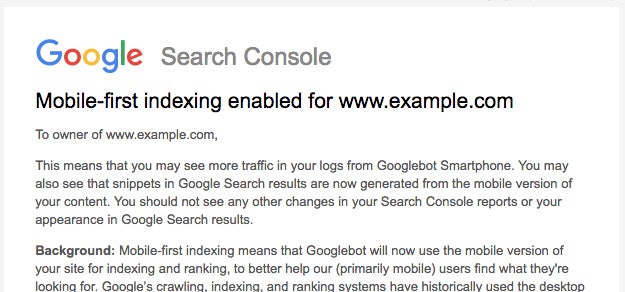
The mobile-first index was officially launched by Google in March 2018. Though there is still some weighting towards desktop-first indexing, eventually, this will all be governed by the mobile web. Starting from last month, sites that Google is migrating to its mobile-first index will be notified through Search Console via the following notification:
The introduction of the mobile-first index is the next logical step from Google in its pledge at making the web more mobile-friendly.
Above all, it’s a direct response to our general uptake of mobile devices. This has been well documented around the web for a while now, with mobile search first exceeding desktop search in May 2015 and general web browsing on mobile increasing over desktop after that in November 2016.
The inapt and ridiculously coined “Mobilegeddon” back in early-2016 can even be considered a precursor to the mobile-first index. Remember that? When Google announced an algorithm change that was set to favour mobile-friendly sites? Of course, the reality was that nothing actually happened, immediately anyway. While it was a lot of commotion initially, the effects were much clearer as the algorithm developed months later.
So, with Google’s mobile-first index now in full swing, how can we adapt our SEO workflow to accommodate this? I’ve collected a few tips below to help you get started.
Start by understanding the mobile configurations that Google accepts
To accompany the launch of their mobile-first index, Google has also recently published their mobile-first best practice guidelines. Understanding the ins and outs of these guidelines serve as a great introduction to the world of mobile-first indexing and I recommend that all SEOs and digital marketers alike get their heads around this documentation first before going any further.
In summary, Google acknowledges five mobile website configurations. These are:
Responsive websites
Responsive websites serve the same HTML on all requested URLs, regardless of the device you’re using. The content and layout simply renders and “responds” differently depending on your selected screen size and uses breakpoints to snap to a mobile or desktop viewport.
This is Google’s recommended configuration, and so it should be your preference when choosing a mobile design.
You’re dealing with one piece of HTML code so no duplication of content will occur. This also makes content and website management easier as there is no sitewide canonicalisation to work with. Opting for a responsive design, therefore, will arguably make your site most eligible for mobile-first indexing as there will be no change when it comes to its interpretation (well, no change as such, but more on this later…). Afterall, the mobile version of your site is the same as your desktop version.
Dynamic serving
Dynamic serving websites render different HTML and CSS documents depending on the device you’re using. Though URLs stay consistent, like those on responsive websites, mobile content is “hidden” when users and user-agents access your site via desktop and vice versa. To initiate the correct user-agent to crawl your website, whether that’s Googlebot (Desktop) or Googlebot (Smartphone), your server needs to use the Vary HTTP header to signal your site changes and request that the correct user-agent crawls your site.
Though content is still being served via the same URL, as of March 2018, Google will start preferring your mobile serving for indexing under this configuration. You can find more information on dynamic serving websites here and their best practice guidelines for mobile-first indexing here.
Separate/parallel URLs
With separate/parallel URLs, your website will serve “mobile” counterparts via a different URL, typically using an “m.” subdomain.
Like dynamic serving websites, this approach is becoming increasingly outdated as it presents a whole host of additional site management considerations. However, depending on your resource, it may still be a configuration you have to work with. Take Topman, for example, whose mobile site still uses this design, regardless of their dominance on the UK fashion market: https://m.topman.com/.
Moving forward, Google will prefer your mobile URLs when it comes to mobile-first indexing. However, it’ll be interesting to see how this configuration fairs in a mobile-first SEO world, especially when you consider the turbulence it’ll cause to canonicalisation and the distribution of PageRank.
Accelerated Mobile Pages (AMP)
Accelerated Mobile Pages, otherwise known as AMP, is an open source initiative launched by Google in February 2016. It serves to help make the mobile ecosystem better for site owners and users alike, namely through a noticeably increased page speed. Using AMP libraries and frameworks, site owners are given a quick and optimised solution to deliver their content in a mobile-friendly manner.
This project was immediately adopted by news outlets and other publishers but has also been seen some uptake from e-commerce businesses also.
Content via AMP delivery uses a similar configuration to parallel URLs, where your mobile serving is available through counterpart URLs, for example, those found under an /amp/ sub-directory. The same best practice guidelines therefore apply.
If you rely on AMP HTML as the mobile-serving of your site, Google will opt for this when mobile-first indexing. However, if you use a combination of AMP and non-AMP when marketing to your mobile users, Google will prefer the latter.
Similar questions to parallel URLs may indeed apply here; how will mobile-first indexing affect sites using AMP? Especially when there isn’t a non-AMP alternative available and you consider the AMP version of your site to be the mobile canonical. After all, this initiative is all about presenting a lightweight version of your content to mobile devices, with arguably many internal links and other SEO considerations removed.
Desktop only
Desktop only websites mean you do not have a configuration ready for mobile browsing. The content available on desktop is therefore served to your mobile users as well.
Google’s acknowledging “desktop only” websites for mobile-first indexing is somewhat of a misnomer as this configuration is intrinsically not suitable for mobile. Going ahead with this configuration will undoubtedly harm and diminish your organic visibility if it hasn’t done so already, as you’re not providing users with a mobile-optimised experience. This is a notion that directly contradicts their best guidelines in general, not just those for mobile-first indexing.
Google will still “accept” this site configuration for mobile-first indexing but in no way is it ideal. If by 2018, you’re still not mobile-friendly then you seriously need to consider launching a new website that’s better suited for mobile usability.
If you’re unsure whether your site is mobile-friendly, I recommend using Google’s mobile-friendly tester or running a report via their Lighthouse Chrome extension for wider mobile auditing.
Using Chrome’s Device Toolbar to emulate a Smartphone
Many SEOs, including Mike King, have started acknowledging the power of Chrome’s “Inspect” feature for technical SEO benefit due to its serving of rendered HTML. And as the mobile-first index begins to roll out properly, I believe its use will become ever more popular and prevalent in our industry.
As a starting point, we need to start viewing web pages through the viewport of a mobile phone, not a desktop.
To do this via Chrome, first access the “Inspect” panel by right-clicking anywhere on a web page. Once the panel opens, find the device toolbar icon situated nearer the top-left of the UI. I’ve highlighted this in my screenshot below:
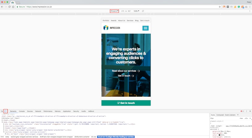
From there, you’re able to toggle through several iOS and Android devices (also highlighted in the above screenshot).
It’s a good idea to “pin” this tab to your browser window for instant access. That way, you’ll always be prepared for the mobile-first approach as you’re analysing your web content.
Alternatively, use BrowserStack
Granted, Chrome’s Device Toggler does an excellent job of interpreting a mobile view but remember; it is only an emulator. For more precise mobile browsing from your desktop, we recommend using tools like BrowserStack.
While it is a paid platform, it’s flexibility between changing mobile devices and even mobile browsers is unparalleled. You’re testing from real devices too, which are being physically streamed to the web app from device factories and virtual machines – clever, eh?
View your website through the eyes of Googlebot (Smartphone)
Though still relatively new compared to other functionality within Search Console, “Fetch as Google” has quickly become one of the more widely adopted tools on the platform, especially for requesting indexing of newly launched pages on your site. (Please note, at the time of writing, this feature is only available on the old version of Search Console and is yet to be ported over to the new Search Console.)
The process of viewing your mobile web pages as Google is mostly similar to before on Search Console, you just need to ensure that you’ve selected “Mobile: Smartphone” before fetching and rendering your URLs. This will allow for the Googlebot (Smartphone) user-agent to crawl your pages.

Here you’ll be presented with how Google and users “see” your mobile content via two simple screenshots. It’s important to note here that you’re not viewing your content as Google (Smartphone) as this isn’t where rendering occurs, mobile or otherwise. Instead, this function uses Google’s web rendering service (WRS) that is based on Chrome 41, a feature that is executed only by Google’s indexer, Caffeine. The “Fetch and Render” feature is, therefore, a combination of both the mobile crawler and indexer at work.
If you haven’t got Search Console access, “Fetch and Render” via Screaming Frog instead
If you haven’t got access to a Search Console profile to action the above, you can achieve similar results via Screaming Frog. However, there are a few more steps involved (see below, correct as of v9.2).
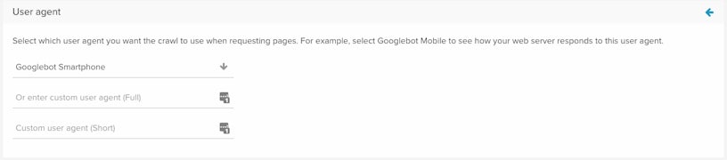
Firstly, you want to change Screaming Frog’s crawler to Googlebot (Smartphone). To do this, navigate to Configuration > User Agent.
Once clicked, the “User-Agent Configuration” window will open. From there, select “GoogleBot for smartphones (post April 18th 2016)” as highlighted in the screenshot below and click “okay”.
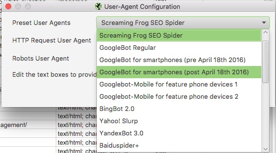
For further testing, you may also want to consider the three other mobile-focused user-agents, i.e. Googlebot for smartphones (pre April 18th 2016), Googlebot-Mobile for feature phone devices 1 and Googlebot-Mobile for feature phone devices 2
The next step is to enable Javascript rendering so Googlebot (Smartphone) can fetch and render your web pages. To do this, access Configuration > Spider. Once the “Spider Configuration” window opens, select “Rendering” from the third tab along.
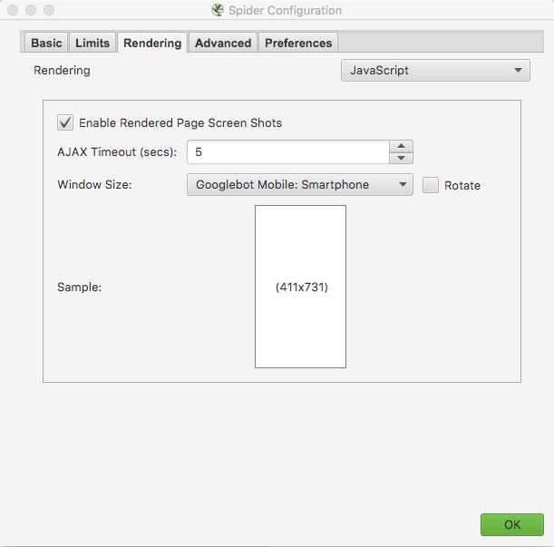
Once you’ve selected the “Rendering” tab, select “JavaScript” rendering and “Googlebot Mobile: Smartphone” window size from both drop-down menus accordingly. Once you’ve clicked “okay”, you’re all set to fetch and render as Google – and it’s business as usual from there. (Please note, this service from Screaming Frog also uses Google’s WRS but it’s based on Chrome 60 rather than Chrome 41 which is what Caffeine uses when rendering content.)
Set Screaming Frog to crawl your site and wait for the data to populate in the UI. However, expect this to take much longer than usual with JavaScript rendering enabled. To view the rendered pages, select a URL and access “Rendering” using the bottom panel of the UI.

By viewing your mobile content as Google, you’re able to analyse what that the search engine sees when interpreting your website for rank. This means you’ll be able to take actions accordingly depending on how a page is rendered. For instance, if some elements of your core content are being hidden by JavaScript, you’ll be able to work with your developers to ensure that content is made visible upon page load.
Get into the habit of auditing with Googlebot (Smartphone)
We touched upon changing Screaming Frog’s crawler to Googlebot (Smartphone) above. This mentality now needs to be used regardless of the site crawler and auditor you use.
Most major site crawlers like DeepCrawl, Ryte, and Botify all support user-agent adjustments, so you need to make sure you opt to audit with Googlebot (Smartphone) where needed. If your mobile site opts for a responsive design, don’t expect to see much difference between your reports. It’ll be where you use an alternative mobile configuration where you’ll need to keep more of a keen eye.
Actioning Googlebot (Smartphone) to crawl your site via DeepCrawl can be set under “Advanced Setting” when setting up a crawl
Start auditing with a mobile-first mentality
Once you get into the habit of auditing with Googlebot (Smartphone), it’s then a case of extracting insight using a mobile-first mindset. At the forefront of your mind, you need to be asking yourself, “How will this content fair under Google’s mobile-first index?”.
What you’re looking for are variances between your desktop site and your mobile site. Here are some considerations to help you get started when auditing for mobile-first;
Are your bi-directional and index signals correct?
Like with any website, mobile or otherwise, you need to ensure your key landing pages are indexable and in a mobile-first world, this goes well beyond the use of noindex meta robot tags.
For separate URL configurations, in particular, you need to ensure your bi-directional signals are set up correctly. That is, your desktop URLs stating their mobile counterparts via rel=alternate tags and your mobile URLs then reciprocating these with canonical tags pointing back.
Does your XML Sitemap contain all your indexable Mobile URLs?
One of the first ports of call in any technical SEO audit is assessing the quality of your site’s XML sitemap. Namely, you’re looking for all indexable URLs to be included and for all non-indexable URLs to be removed. This stays true in a mobile-first world, especially when dealing with separate URL configurations. Make sure your mobile URLs take priority and if required, list these out in a separate file under an over-arching XML sitemap index. This way, you have more visibility of potential discrepancies present in your mobile site’s index status.
Does your mobile site have the same robots.txt directives?
Again this is mostly applicable to mobile sites using the parallel URL configuration. Since you’ll be using an “m.” subdomain, you need to ensure your robots.txt file is uploaded here also. Google states that a robots.txt file that has been uploaded to your root domain isn’t necessarily valid for your subdomain as well. So, for improved crawler control, ensure a robots.txt file is retrievable via all variants of your domain.
How is your metadata optimised for mobile?
Title tags and meta descriptions can still be considered the MVP when dealing with search engine optimisation. It follows, therefore, that your mobile site needs to contain the same level of metadata optimisation as your desktop site. Again, this will be a given when working with responsive designs and more of a consideration when dealing with dynamic or separate URL configurations. Above all, it’s simply a case of making each tag equivalent for all device variants.
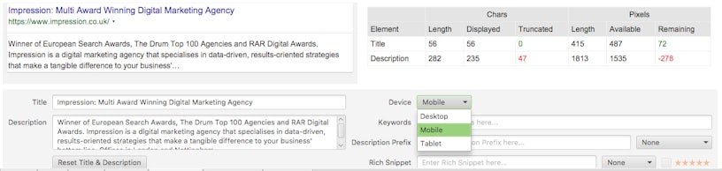
Upon creating new pages, you’ll also need to start optimising your metadata for mobile SERPs, not just the desktop SERPs, as nuances within character and pixel limits can present themselves. I recommend using an advanced snippet optimiser for this, like this one from Ryte or via Screaming Frog’s “SERP Snippet” feature.
How does your content differ on mobile? Is any content hidden?
Similar to your metadata, you need to ensure your content is near enough equivalent on mobile as it is for desktop. Hidden content provides roadblocks for search engines, especially when a user action is triggering it and especially when JavaScript is involved. Google has stated they expect some degree of hidden content as this is largely unavoidable when working with smaller viewports. However, test where you can and ensure your most valued content is visible on mobile.
Try rendering your content as Google as much as you can, using the steps I outlined above, to find any discrepancies between your mobile and desktop counterparts.
How do your internal links differ on mobile? Are any contextual links removed?
When we talk about hidden content for mobile, we’re often referring to the text, images, videos or any other rich media that’s hidden from your landing pages upon page load. But what about internal links? These are arguably just as important as they directly relate to PageRank.
Again, the main issues to look out for are discrepancies between the internal links for your desktop and mobile sites, especially those that are contextual and historically popular with your audience. Both Sitebulb and DeepCrawl provide great tools for visualising your internal linking structure so I would recommend utilising these so you can properly compare how your internal links differ across devices.
By no means is this list exhaustive as I haven’t even discussed hreflang considerations or those related to structured data. Auditing for mobile-first is indeed its own beast and a topic that merits its own post. However, to help guide you further, I’ve curated some useful resources below that provide more insight into mobile-focused SEO audits;
- Technical SEO in the Mobile First Indexing Era (Barry Adams / BrightonSEO 2018)
- Conquer the Mobile-First Index (Botify)
- How To Do A Mobile SEO Audit: The Step By Step Guide (Aleyda Solis / State of Digital)
- DeepCrawl’s Ultimate Guide To Google’s Mobile-First Index (DeepCrawl)
(If you know of any additional resources that I should add to this list, feel free to forward these onto me)
Start monitoring smartphone keywords
It’s questionable as to whether SEOs monitor their smartphone keyword rankings in addition to their desktop keyword rankings. I’m inclined to believe that it hasn’t been entirely adopted, but with the mobile-first index now officially rolled out, it certainly needs to be.
Comparing your smartphone rankings to your desktop rankings is great insight into how Google perceives your content on both devices. The more insight you can retrieve from your mobile positioning, the better off you’ll be when mobile-first is enabled for your site. This is because, as we know, the mobile-first index will soon be the single index used by Google (see “Will Google have different indexes for mobile and desktop?” heading on this article by Barry Schwartz).
Smartphone rankings are now supported by most keyword ranking providers, including STAT and AWR, but at the very least, you can monitor these via the new Search Console.
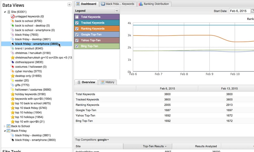
Above: STAT is Impression’s software of choice when it comes to keyword monitoring
Start reporting on KPIs by device
You’ll also need to start examining your performance by device through Google Analytics if you don’t already. Irrespective of the move to the mobile-first index, this is still invaluable insight to see how your audience behaves cross-platform and how they utilise smartphones as part of their customer journeys.
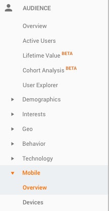
Viewing mobile engagement through Google Analytics is a simple task and can be achieved through several approaches.At the bare minimum, heading to Audience > Mobile > Overview will allow you to see how your traffic engagement compares over desktop, tablet and mobile for any period given.
You can then select the checkboxes next to each device and click “Plot Rows” to see these plotted over-time against your total traffic.
However, the simplest approach to viewing organic mobile traffic is by creating your own custom segment via Google Analytics.
To do this, start by making a copy of the “Mobile Traffic” custom segment that should exist by default.

All you need to do from there is give your custom segment a name, i.e. “Organic Mobile Traffic”, and create a new filter under “Conditions” that exactly matches the medium “organic”. After clicking “Save”, organic mobile traffic engagement will then be displayed across the entirety of Google Analytics properties. By adding other custom segments, like those from Desktop and Tablet, you can then analyse how organic mobile traffic compares to other marketing channels and devices of yours.
Your organic mobile traffic isn’t indicative of how your overall organic traffic will perform with mobile-first indexing, but the exercise is still important when adapting our SEO workflows more towards a cross-device and modern browsing mentality.
Summary
There can be no doubt that the recently launched mobile-first index will cause a significant paradigm shift in the SEO industry and organic marketing in general. However, this is largely for the better. As we know, SEO is an ever-evolving discipline and we need to be constantly adapting our workflows to mirror how our audiences are behaving. This is not only applicable to mobile but also to any other new technologies that are thrown at us.
I’ve mentioned a handful of approaches here. If you have any more ideas, feel free to let me know in the comments below or by tweeting me @petejov.


